YERING STATION.
LABEL REFRESH.
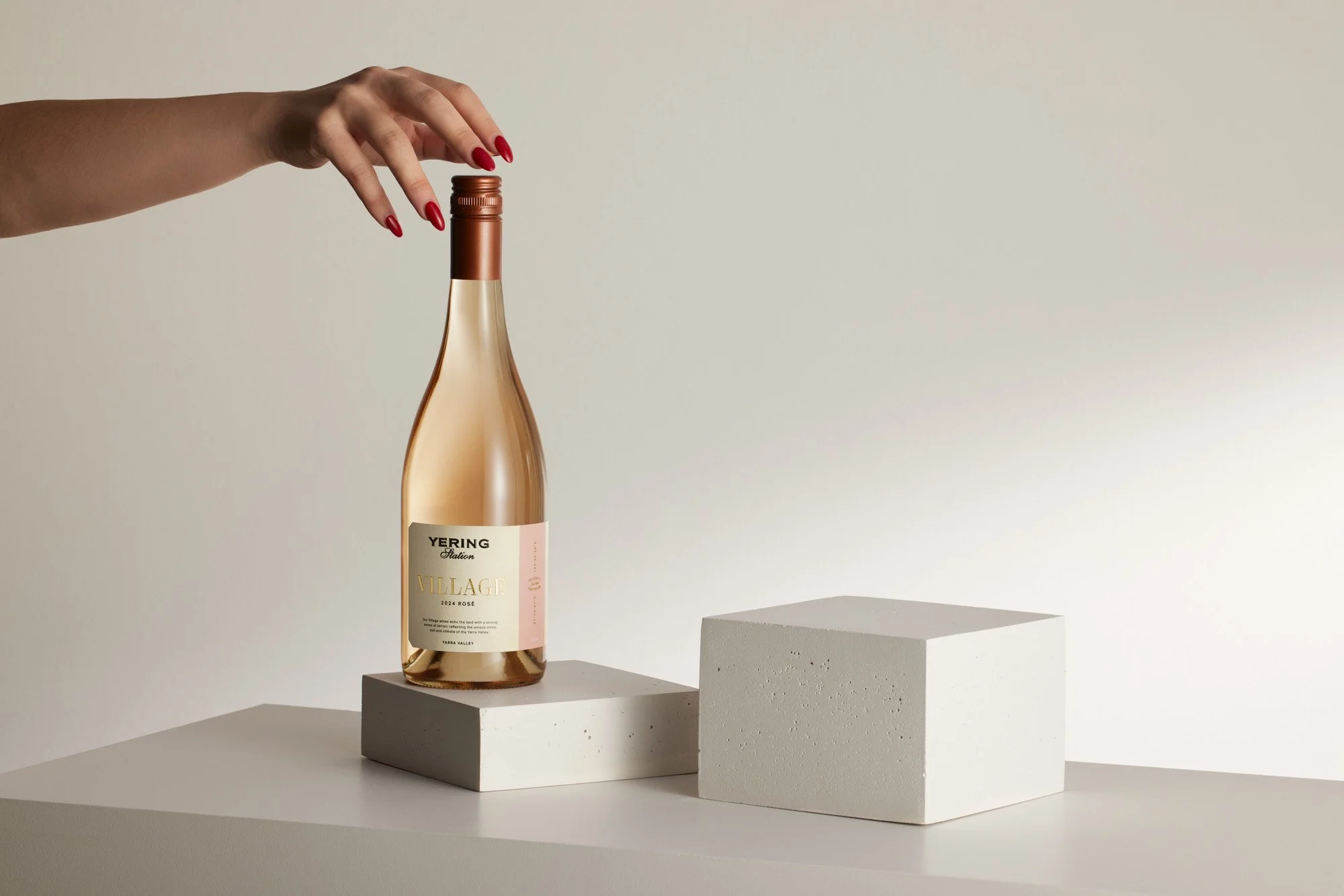
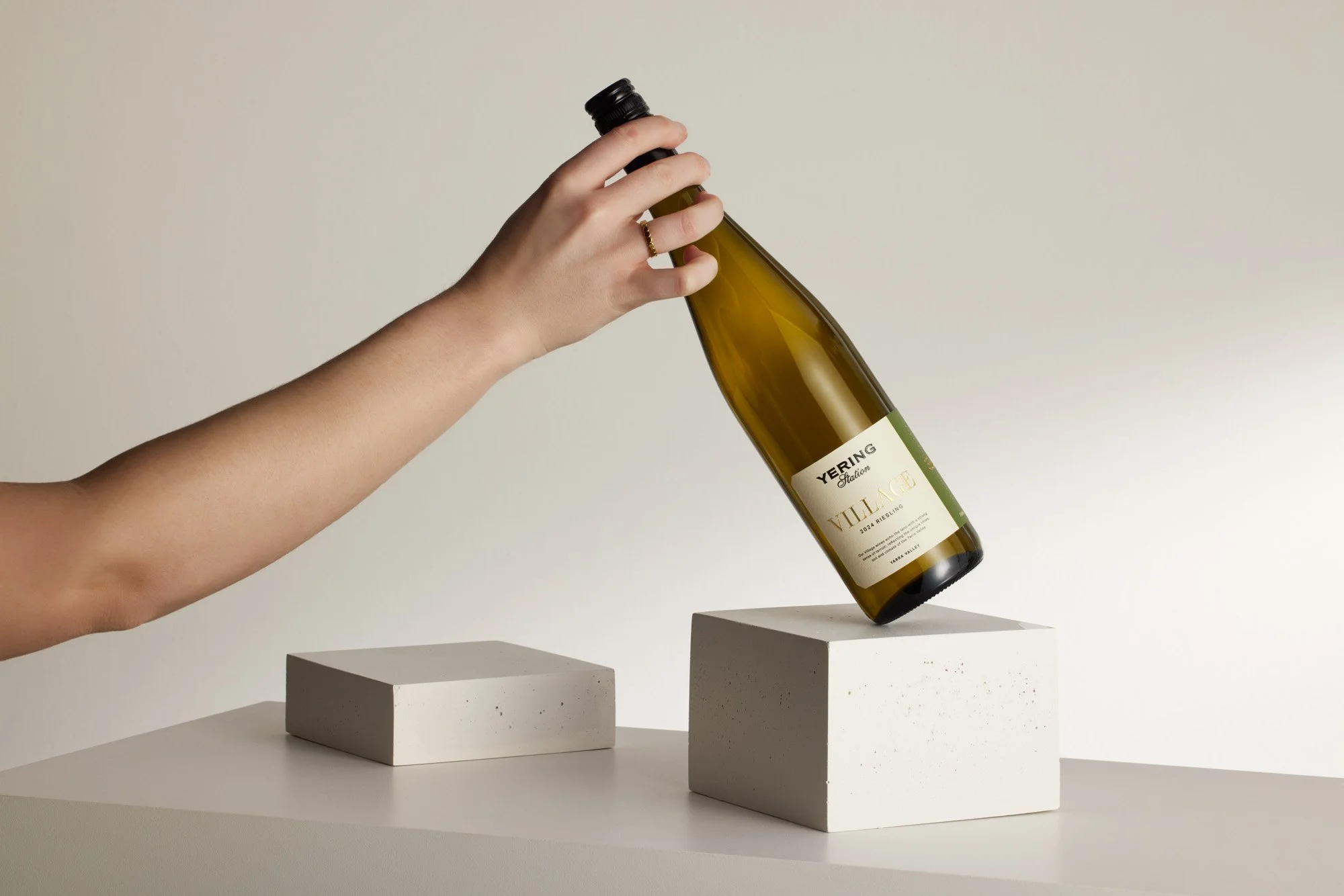
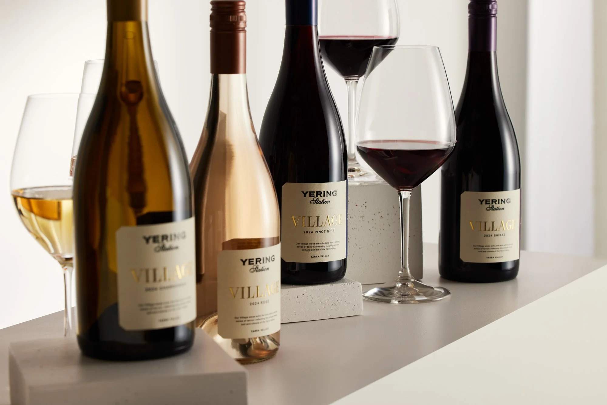
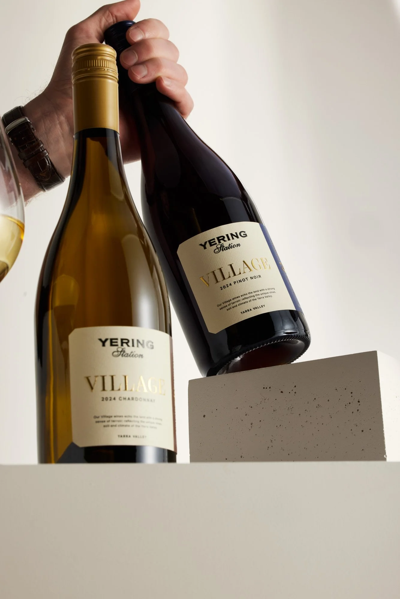
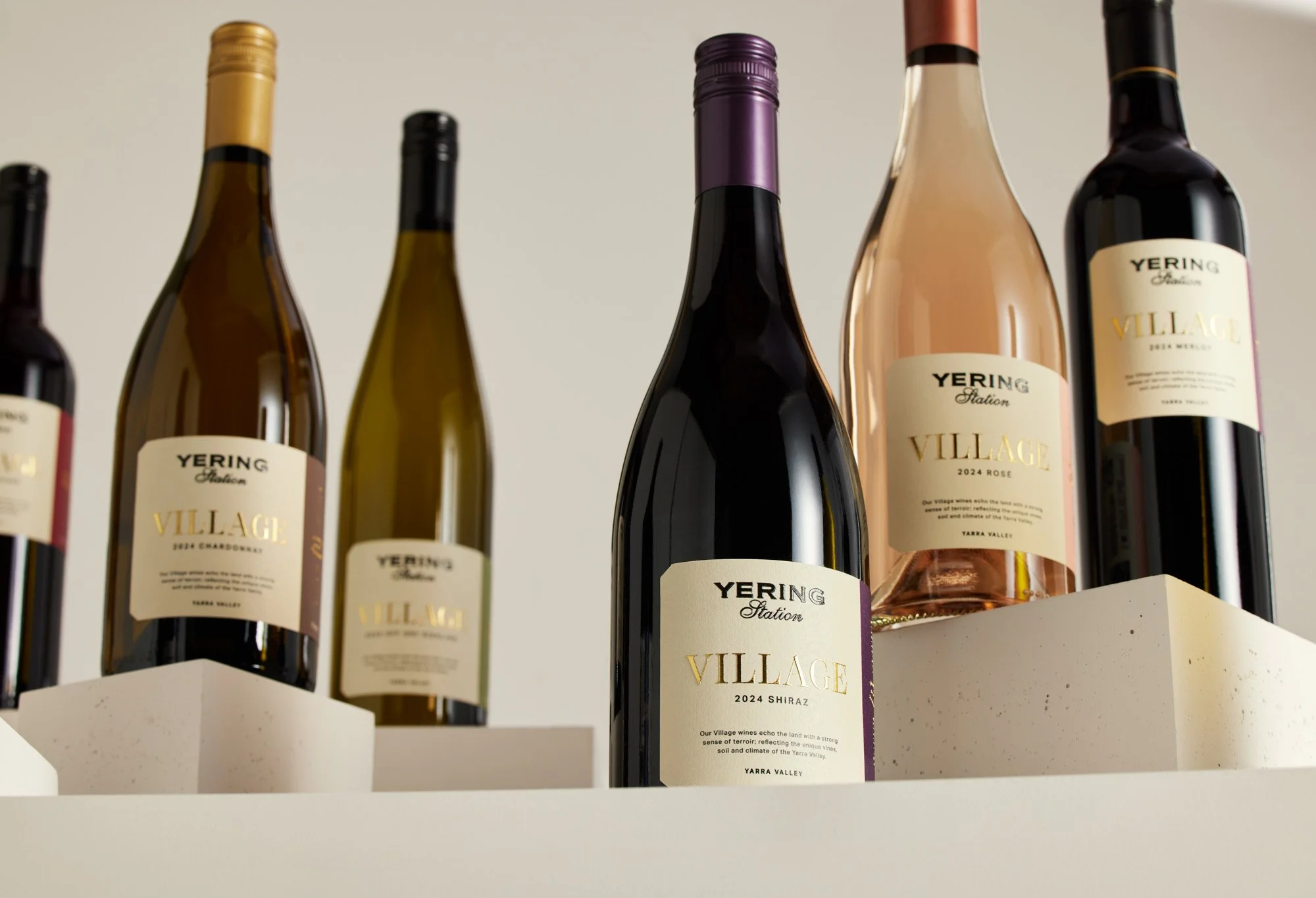
One of the brands most loved wines, but a packaging redesigns that helped it spring back to life. This beautiful label speaks to the elegance, romance and rich history of Yering Station.
With variety differentiation being visualised through a strip on the bend, this label holds true to the power of brand. The core four varieties are matched with a colour cap and all are printed on beautifully, slightly textured stock. A mixture of high-build gloss and foil across the label, highlights not only the brand name, but the coordinates; paying homage to the heart of the Yering Station Estate.
While there isn’t a lot of real estate to work with on wrap labels at times, colour and typography play a significant role in shifting the Village variety and label into a far more premium, modern ad luxurious space. Earning itself AGDA 2024 Finalist Award.
CLIENT: YERING STATION
PHOTOGRAPHER: JAMES MORGAN